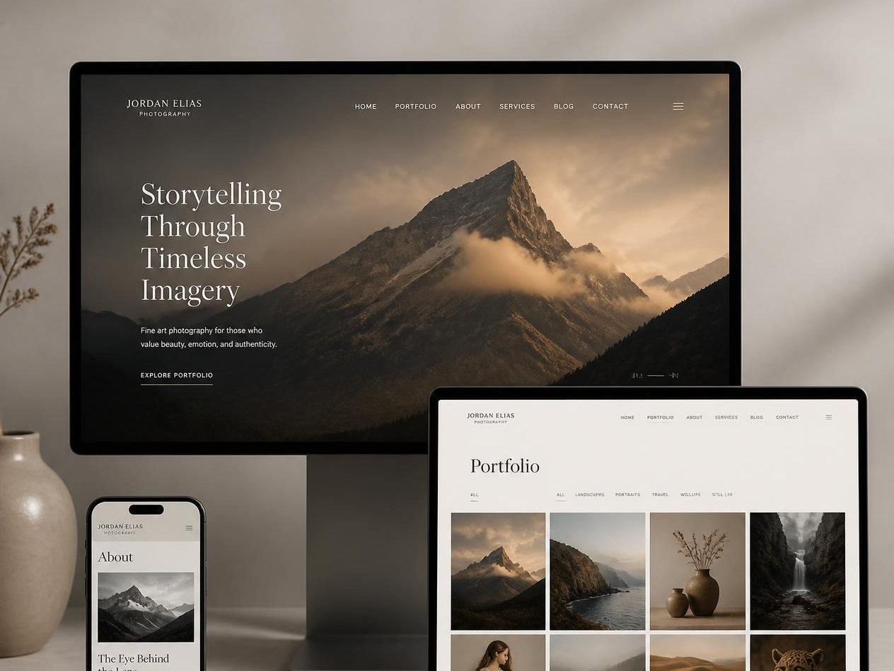
Screenshots of the actual template. Every page, component and state shown is included in the download.
Meridian — Photography Portfolio Website Template
A warm, gallery-grade portfolio for photographers, with filterable series and image handling that respects the file.
- Category
- Portfolio
- Pages included
- 8 pages
- File format
- ZIP · HTML, CSS, JS
- Delivery
- Instant download
- Licence
- One end product
- Support
- 6 months included
- Updates
- Free, for life
- Last updated
- May 2026
- Secure payment via Stripe or PayPal
- Download link valid for 72 hours, re-issued free
- No account required, no subscription
Overview
Meridian is built for photographers who sell on atmosphere: landscape, travel, wedding and fine-art work that deserves the full width of the screen. The hero runs edge to edge with the title set over the image, and the portfolio page groups work into series you can filter without a page reload.
Image handling is the point. Galleries use responsive sources and lazy loading, lightbox navigation works from the keyboard, and captions carry the location and the year, because that is what people ask about.
What's included
- 8 hand-built HTML pages with matching CSS and JavaScript
- Filterable gallery with a keyboard-accessible lightbox
- Series layout for grouping images into bodies of work
- Editable design tokens for colour, type scale and spacing
- Booking enquiry form markup wired for Formspree, Netlify Forms or your own endpoint
- Setup guide, component reference and a licence summary
Pages and sections included
8 ready-made pages:
- Home
- Portfolio
- Series detail
- About the photographer
- Services and rates
- Journal
- Journal article
- Contact and booking
Built from these sections and components:
- Full-bleed hero with overlaid title
- Featured series teasers
- Filterable gallery grid
- Lightbox with captions and counter
- About with portrait and statement
- Services and session rates
- Client and publication logos
- Journal teasers
- Booking enquiry with availability note
Key features
Keyboard-first lightbox
Arrow keys, escape to close, focus returned to the thumbnail you came from — accessible without a plugin.
Series grouping
Organise images into bodies of work with their own cover, statement and location, then filter them from the portfolio page.
Responsive image sources
Markup ready for three widths per image, so a phone never downloads a 3000px file.
Caption discipline
Every image carries title, location and year fields, set in one data file rather than scattered through the HTML.
Rates page included
A session and licensing rates layout, so the pricing conversation starts before the first email.
Warm neutral palette
A bone and stone palette tuned so warm-toned photography does not clash with the interface.
Responsive and mobile design
Meridian is built mobile-first and tested at 320, 375, 414, 768, 1024, 1440 and 1920 pixels before release. Small screens are not an afterthought — navigation, tables, galleries and the 8-page structure are each redesigned for the space available rather than shrunk to fit.
- Fluid type and spacing scales, so headlines stay in proportion between a phone and a 27-inch display.
- Tap targets of at least 44×44 pixels on every control, with visible focus rings for keyboard users.
- Images served at sensible dimensions with lazy loading below the fold and reserved space to prevent layout shift.
- Tested in current Chrome, Safari, Firefox and Edge, on iOS and Android, and with reduced-motion preferences respected.
Customisation and editing
Everything you will want to change is in an obvious place. Colours, fonts, radii and spacing are CSS custom properties declared in one block at the top of the stylesheet — change those six or so lines and all 8 pages follow. Text and links are edited directly in the HTML, with comments marking each section.
- No build step, no Node, no package manager — open the folder in any editor and double-click a page to preview it.
- Swap images by dropping your own files into /assets/img using the same filenames, or point the markup anywhere you like.
- Every component is commented and reusable, so adding a page means copying a block rather than writing CSS from scratch.
- Clean, semantic markup that ports cleanly into WordPress, Webflow, Astro, Eleventy or a React project when you outgrow static files.
Ideal for
- Landscape, travel and documentary photographers
- Wedding and portrait photographers taking bookings online
- Photographers licensing prints and editorial usage
- Anyone leaving a slow, gallery-plugin-heavy site behind
Frequently asked questions
Comfortably a few hundred. Images load lazily as you scroll and the lightbox only fetches full-size files on demand, so page weight stays flat as the gallery grows.
The rates page and each series include a purchase block you can point at Stripe Payment Links, Shopify or a print lab. No cart is bundled — keeping checkout external keeps the template fast.
Basic comfort with HTML and CSS is enough. Text, images and links are edited directly in the HTML, and colours and fonts live in a short list of variables at the top of the stylesheet. If you can edit a text file, you can launch one of these.
One licence covers one end product — your own website, or one client project. You can modify the template as much as you like. You cannot resell, redistribute, sublicense or share the template files themselves.
Anywhere that serves static files: Netlify, Vercel, Cloudflare Pages, GitHub Pages, or classic shared hosting via FTP. Most are free for a site this size, and the guide covers each.
Because templates are delivered instantly and cannot be returned, all sales are final once the download link is issued. If a file is corrupt or a page does not match its preview, contact us within 14 days and we will fix it or refund you in full.
You might also like